Collections | Numbers
Friday, August 22, 2008
Inspiration | Designers Guild
One of the places I always go when I need a blast of colour inspiration is the Designers Guild web site or Tricia Guild's book, "Pattern". Both are a great way to remind myself that these days, in design, anything is possible - be bold and be daring. Go on, I dare ya!
Thursday, August 21, 2008
Window Shopping | Cog and Pearl
Creepy, yet beautiful, decoupaged John Derian plate to serve your cheese and crackers on. From Cog and Pearl in Brooklyn.
Labels:
design,
designers,
illustration,
stores
Collecting | Counter Culture
On a shelf in Doug's studio there is a collection of miniature items and a book by Louise Fili and Steven Heller that I think you might like. Counter Culture is a small picture book on vintage, miniature mannequins used for advertising during the first half of the last century. Here are some images from the book.
These counter top darlings were really important to the retail business in the 1930s and 40s. They are hard to find in good condition these days so if you see one, snap it up! Or email Doug - and he will!
Labels:
collections,
design,
designers,
fashion,
inspiration,
local
Eye Candy | Black Mirrors
A couple of black, cut glass mirrors from Graham and Green - really love these!
Wednesday, August 20, 2008
Illustration | Magic Jelly
Let's have some fun today. Magic Jelly are out of Adelaide, Australia. Illustrator Karena Colquon has great type design skills and a wonderful way with retro imagery. Her packaging designs are wonderful and I am also really loving her super fun blog.
This picture with the 2 dogs was the latest post on her blog yesterday and it is just the kind of photo I love. You can buy some Magic Jelly for yourself at the Magic Jelly Etsy shop right here.
Labels:
design,
etsy,
graphic design,
illustration,
paper,
stores
Cartolina Giveaway | Winners!
Well we have a winner - and not just one winner we have 3. I am very excited to announce the winners of our first ever Cartolina Giveaway. I was so surprised how many entries we had, almost 130! - thank you all so much, we really enjoyed reading them! I would love to make this a regular feature on Cafe Cartolina - so stay tuned!
So with a little help from our furry studio assistant Mimi we were able to randomly scoop out the winning entries.
Our first prize of Cartolina products valued at almost $100 goes to user name kim & ryan
Congratulations you 3 - email me asap and I will send out your prizes.
Random Objects | Urban Outfitters pillow
Tuesday, August 19, 2008
Design | Oh no, not more bird cages
Ran across this yesterday - thought we could add it to our collection of wired things that we seem to have accumulated this week. Very 1960's Paris, very Pink Panther - don't you think? From Methane Studios via Mr French
Eye Candy | Photo Opportunity
Sometimes I collect images purely for the mood they evoke. The top picture is a page from the Anthropologie catalogue. The middle picture is from Pedlars - I love the random way these recycled tote bags are hanging on that shiny surface. The bottom picture is a snapshot Doug took at that crazy yard sale we went to a couple of weeks ago where we bought those Chinese posters - just a great looking box of random relics.
Labels:
design,
inspiration,
stores
Illustration | Shepard Fairey
These two posters are from Shepard Fairey. Beautiful and interesting - I love both their boldness and their subtlety (with their collage effect). Shepard also produced the poster, Make Art Not War, that I have sitting in the sidebar on the left (thanks for that info Jan). There's a great interview with Shepard here if you would like to know more about him and his beautiful illustrations.
Monday, August 18, 2008
Design | Daisy Janie
I just recently discovered designer Jan DiCintio's fabulous fabric designs, bags and pillows. I just had to share these pillows with you. The fabric patterns are gorgeous - rich, earthy, bold and dynamic.
You can see and buy all of Jan's fabrics, handmade bags and pillows right here on the Daisy Janie website.
Etsy | Blue Bell Bazaar
I am a bit new at Etsy - I still find it a bit tricky to navigate....I can't always find what I am looking for (actually, any tips on that subject would be great). But I have seen the name Blue Bell Bazaar on a couple of different blogs including Poppytalk many times so I thought I had better finally check them out.
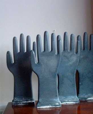
Here are my two favourite things today on Blue Bell Bazaar - very cool flat glove molds that I think are ceramic but look like they are made from zinc, don't you think? Bowling pins - anyone who has come to my house knows that I have a thing for vintage bowling pins and king pins - I have dozens of them in all shapes, colours and sizes. There's lots to see at Blue Bell and they have a mailing list that you can sign up for. Their prices seem very reasonable too.
Labels:
collections,
design,
etsy,
inspiration,
stores
Blog Roll | At Home With Kim Vallee
I am a big fan of Kim Vallee's blog. Kim is Canadian and she is a very creative and prolific blogger. Her blog reads like a stylish, lifestyle magazine and she has an amazing knack of finding incredible stores and new products. I think you will really enjoy At Home With Kim Vallee too.
Kim's blog is so well organized and designed - you can't miss a thing. She groups her images together beautifully to create wonderful editorial montages. Among other things, Kim writes a column for HGTV's blog Style Sheet which is also a great read.
Labels:
design,
inspiration
Garden Party | Conran
I was thinking about those caged chandeliers that I showed you on Friday. Wire objects always appeal to me - their armature forms make me want to grab a pencil and draw them. So I went looking for some more. These colourful ones from Conran are fun. They have a sort of 1960s 'Bewitched' feel to them don't you think? And they are actually quite big - almost a meter high! Not sure what I would do with them. If I had a very white Mod house (which I don't) they would look very groovy swinging in the breeze. I do find their shape quite inspiring especially the slightly off centred, onion shaped one.
These are very handsome birdcages, above, especially the one on the left which has a marvelous tiled zinc roof that will turn to a soft powdery white finish if you leave it outside in the elements for very long. All fun and completely frivolous wired items that caught my attention at the Conran shop.
Labels:
design,
inspiration,
stores
Subscribe to:
Posts (Atom)