Friday, July 30, 2010

Happy weekend!

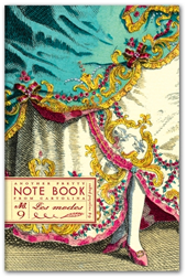
After a VERY long day yesterday, receiving all the boxes of new Cartolina product, I was completely out of time to prepare a post for today - that doesn't happen very often, does it? Sorry about that! Anyway, the good news is that we have wonderful new card designs - hot off the press! Very exciting. Do you have some fun plans for the weekend?
Doug and I are going to pick out some new art for our living room makeover - which is where you come in . . . . we are looking for interesting, bold, graphic 'poster' art to frame for our walls. If you are a regular reader you will be familiar with the style of art we love. So if you have any tips for us - your own art, an online poster shop, vintage posters etc - let me know in the comments below - I'd love that! Thanks! - see you Monday!


Thursday, July 29, 2010

Found - fabulous spec cases!

I just got new glasses. I got 'big' ones. I'm so tired of tiny little narrow glasses. I have a huge computer monitor and I need to have big glasses or I have to move my head to much - know what I mean? So when I saw these glass cases I was all over them. I love how they come in 3 sizes so, not only can I get my glasses in there, I can get my bank card and a lipstick in there too - and what more does a gal need - right?


Fabulous spec cases and clutches from Studio Cherie.

Mystery shoes

It's really bugging me that I don't have any information on these flowery shoes - perhaps they are hand painted? I found them here - so if you know anything about them, let me know ;-)

Aha! Update They're by Jeffrey Campbell! http://needsupply.com/womens/shoes/meow-floral-lace-up.html

Found- vintage map notebooks

These notebook are made by hand by Mr Yen. They are made with vintage maps and have a hand cut Notebook logo cut into the fab covers. They remind me of the map clip boards that I bought at Fabriano in Rome a couple of years ago - maps never go out of style and are endlessly fascinating don't you think?


Wednesday, July 28, 2010

I'm obsessed with this vintage soap packaging - it's so inspiring on so many levels. I hope you love it too. The colour combination on the 2nd one is incredible.


Inspiration - vintage rubber stamps

These are rubber stamps - I love the authentic vintage look of these. They haven't been 'prettied' up in Illustrator. Their fuzzy outline is just lovely. This is one of the reasons we never use vector files or Illustrator in our Cartolina designs because it immediately makes everything look slick and modern. These stamps are from here.


Inspiration - vintage papery

This vintage inspired times-table chart is so charming - and I could probably do with one! Also the graphic, black and white journal is fabulous. All of these are from Avida Portuguesa.


Tuesday, July 27, 2010

Inspiration - recycled saris

Fabulous recycled vintage sari quilts. These are amazing. And, instead of shiny silks, like most recycled saris, these are cotton - how fab! From here.


Window Shopping - Sundance

There are some really neat pieces of 'industrial' furniture at Sundance this season - I especially like these pieces . . .


Window shopping - Modcloth

These are sweet - rosey bed sheets from Modcloth - couldn't resist them. Oh, and they have some very nice summer dresses on sale right now too!


Monday, July 26, 2010

Makeover - episode III


Well, I did it. Half way through I seriously questioned the rationale for doing it, but, I did it! I painted the armoire black. Well, it's not really black it's Benjamin Moore Black Jack which is a charcoal grey but after testing a number of blacks, including Soot and Baby Seal, I settled on Black Jack. I'm pleased with how it turned out. I'm really trying to move away from the woodsy/cabin look but I didn't want to get rid of the TV armoire because it's solid wood - and so much of what you buy these days is not - I just didn't want that huge block of woodgrain sitting in the living room any more!

BEFORE(above) AFTER(below)


I had bought some simple black iron pull rings for the cupboard doors but when I attached them they looked so blah! Then I remembered that I had bought these simple tin rosettes about 10 years ago - and voila, I love them. They are fun and young and a total contract to the slick black surface. This is part 3 of the makeover - if you'd like to follow along - click here! Next up is new art and light fixtures - then the house gets painted - woot!

Inspiration

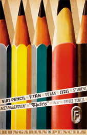
Every so often I catch a glimpse of beautiful, inspiring art on Doug's computer. (For those of you who don't know, Doug's an illustrator. He works for all the major US magazines, newspapers and publishers.) So I raided his stash of vintage posters files and picked my favourites for you . . . .


Blog Widget by LinkWithin