Thursday, July 24, 2008

Photo Opportunity | Le Pain Quotidien

I have been waiting for a good excuse to show you this picture - this is the window of Max Azria in Soho, New York. Isn't it superb? Truly gorgeous - those dresses, that brick wall and the dusty old store front -  perfect.


I took the above picture right before we stopped for lunch at Le Pain Quotidien. Have you ever eaten there? It's a wonderful experience. Roughly translated Le Pain Quotidien means The Daily Bread. The restaurant revolves around a couple of concepts - bread as the centre of a meal and communal tables to meet, eat and gather. The restaurants have an authentic, organic, paired down, freshly scrubbed feel. High ceilings, simple furnishings, pale wood and minimal decor. The design and ambiance of a restaurant is very important to me and if the food is great, well that's a bonus!


The organic meals are served on porcelain cutting boards. Cheese platters and open faced tartines. Chunks of bread with olives, nuts and prosciutto. The long tables have bottles of olive oil and bowls of sea salt down the centre. The food is deliciously perfect and the experience is calming and refreshing. Each restaurant also has a retail bakery and catering service.


Le Pain Quotidien was established in Brussels in the early 1990s. They have restaurants and stores all over the world including a brand new one in Toronto. Their menu is beautiful and you can see it here on their website
Of course this is not a restaurant review - Le Pain Quotidien is a perfectly executed concept from the simple design of the room to the sophisticated simplicity of the menu. It is a a respite from the city and from the frenetic energy of the street. 
Aaaaah blogging makes me hungry.
Ephemera | Pour l'art et la Pensee.

What can I say? - It's a very small, beautiful thing and I'm just sharing the love!  
{ Gotta keep a nice balance between the old and the new here at the Cafe. }

Wednesday, July 23, 2008

Window Shopping | Graham and Green

I still have a lot of friends in the UK - and I seem to have to send them gifts on a frequent basis - you know, birthdays etc.
So for the last few years I have found it easier to order gifts from British, mail order, online stores and then I know that the gift will arrive on time and it can be returned if it's not right. One of my favourite places to orders gifts is Graham and Green. So I thought that this morning we would just have a little eye candy from their current collection. . . no pressure this morning just relax and enjoy . . . 


I love this - it reminds me of a similar door stop we had when we were kids - a big stone elephants foot that my grandparents brought back from India.


These buckets are made from recycled tires - I love the fancy bellows too.


A black glass, venetian cut mirror - isn't it fabulous ? (Not sure that I would leave it propped up on the floor with a springer spaniel in the house though!)  Graham and Green have the most wonderful photography on their website and their stores in London are gorgeous. I hope you have enjoyed this little self indulgent window shopping trip as much as I have!
Graham and Green have shops on the King's Rd, Elgin Park and Regent's Park Rd, in London . . . take a look at their website it's faster than going to London and it doesn't involve airline food.
Design | Design books

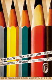
I thought since you seemed to like yesterdays Paris street map design then you would also appreciate the wonderful deco design of these 2 labels.
I love the way the clouds are represented in these crudely printed designs.


Steven Heller and Louise Fili (my all time favourite designer) have a great series of design books published by Chronicle Books. The series includes French Modern, British Modern, Dutch Modern, Italian Art Deco, Japanese Modern and American Art Deco. They are a great resource for designers - pages and pages of posters, magazine covers, packaging and labels (just like the labels above). I thoroughly recommend this series of books - they are a well used source of  reference in our studio. And check out Louise's portfolio it is truly awe inspiring.
Ephemera | Paris street map.

Do you think this is interesting? I do. This is a street map of Paris that I think was printed in the 1920s. The zigzag frame is so cool and, considering the booklet is almost 90 years old, I am surprised how current it looks. I think this would be classified as French Art Deco. When I saw it this morning on the table it reminded me a lot of the post that I did yesterday of Grady's illustrations - what do you think?

This piece comes from a selection of antique maps of Paris that I have collected over the last few years. I love it more for it's cover than for it's map!

Tuesday, July 22, 2008

Illustration| Grady McFerrin

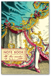
When we were in New York I bought a notebook at Anthropologie for my friend Lisa. I loved its simple illustrated cover and the words on the back, "Where troubles melt like lemon drops."  - from the song, "Somewhere over the Rainbow" if I am not mistaken.
Well, coincidentally, while I was buying the pretty notebook Doug was having a visit with the illustrator of the notebook, Grady McFerrin, at his studio in Brooklyn. And it wasn't until this morning that I put 2 and 2 together and figured out that the illustrator that Doug had been talking about for the last week was the same guy that produced the beautiful art for Lisa's book. So I went to Grady's web site and now I can't wait to show you his work.


Grady has illustrated a number of different notebooks, journals and stationery for Chronicle Books (above). On his web site you can see samples of some brilliant hand drawn type especially on some of his fabulous wine labels. I don't usually buy wine just for the label but these ones would catch my eye for sure - I love the distressed vintage look and the  faded colours.


And finally, the posters. I had a hard time choosing which posters to show you - and I really hope you will go and visit them all because they are simply wonderful. Each one is a beautiful piece of art. A magical combination of hand drawn type, pattern and vintage inspired elements. Each piece looks like it has been individually screen printed by hand. This is an artist who knows how to blend his passions and his skills to create uniquely personal, yet publicly accessible art.

Grady McFerrin lives in Brooklyn, NY. 
You can see more of his work here
Grady is represented by Gerald and Cullen Rapp in New York.

Monday, July 21, 2008

Paige Russell | North American Wildlife Series

So I am running the risk of being told that I am the last one to have noticed these - oh well! 
I was browsing through the Poppytalk Handmade Market  and I stumbled across this RV by Paige Russell. According to Paige this is a vase or an "anything vessel". I love it. I love it's originality and I adore the way she has photographed these pieces against a paint-by-numbers background. Very clever. I think you will love them too.


So as you probably know I am often influenced by vintage design in my own work and you may start to think that's all that inspires me but, on the contrary - when I see an original idea, whether it is modern, vintage or kitch, I am inspired. It's the originality of the design that excites me and motivates me. This series of vessels is a wonderful, original concept. The real beauty is in the idea. Paige has produced each one beautifully and her choice of paint-by-number presentation is brilliant. Good job - you have inspired me today. Thanks!

Paige Russel is a BC artist based in Kelowna, a 4 hr drive from here - we're almost neighbours!
You can buy her wonderful art at her Etsy shop here.
Conran Shop | Pillows

Couldn't resist these pillows from the Conran Shop UK. Just had to slip them in this morning!


Just noticed that I really must, subconsciously, be into orange and tourquoise at the moment - looks like my last 3 posts all have the same colour palette.
Web Finds | Seven-Nine and Andy Sargent

Thought these were really interesting when I stumbled upon these the other day. I am really drawn to the vintage styling, the distressed wood, the fun type faces and retro colours. I'd like a whole group of these stacked on my bookshelf!


There doesn't appear to be much information on the creator - Andy Sargent at this web site. Perhaps if you know him you can fill me in.

Sunday, July 20, 2008

Premium Goods - Bazaar Items.

Thought you might like these images. The first is some old type on a transom window, taken somewhere in the Flatiron District in New York when we were on our way for lunch at Chat N Chew. The second picture I am afraid to tell you I can't remember where I took it - Anthropologie perhaps? Do you recognize these beautiful plates?


Illustration: Brad Yeo

We had an interesting (and fun) weekend. We had some guests - illustrator Brad Yeo and his partner, painter Tanya Rusnak. I don't have any images of Tanya's work but I do have some of Brad's illustrations. I will try and find some images of Tanya's work for you this week. Brad's wonderful illustrations are produced for books and magazines and you can see more of his work here.


Brad's work is represented by Gerald and Cullen Rapp in New York. Hope you enjoy it as much as I do. You can also buy prints of Brad's illustrations online at Thumb Tack Press.
Blog Widget by LinkWithin