Inspiration | Packaging | Type | Old | New
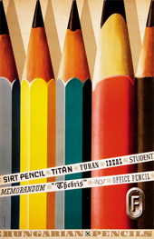
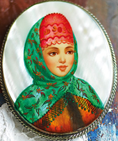
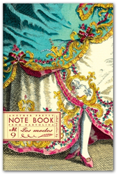
These items all have something in common. I am not sure quite what it is yet but if I was curating a show I would gladly hang all these images together - or if I was creating a vignette or a still life I would use all of these items together on a table top. I think it may be the calligraphic quality of the patterns and shapes used in the surface designs. I like the muted colours and the calmness that these curious, busy patterns can create. All of these were designed by very talented designers and typographers - could have been a few months ago and, for at least a couple, it was a hundred years ago.


This last piece is by artist Luca Lonescu.


