Showing posts with label typefaces. Show all posts

Tuesday, April 26, 2011

Vintage labels

Some of you will be familiar with the designer David Pearson's work - well he also has a wonderful collection of vintage ephemera that he has allowed me to share with you. The typography on these vintage luggage labels is fabulous. I especially love the first one - 3 dimensional type is always a winner.


Wednesday, March 16, 2011

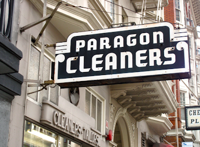
Vintage signage

So many great vintage signs in SF - I especially love this first one - it goes so perfectly with the surrounding architectural details. Enjoy . . . . .


Tuesday, October 12, 2010

Vintage finds

A few things that caught my eye this weekend on Etsy . . . I'm always drawn to vintage curiosities especially anything with old type - or any inexplicable pieces like this hand that looks like it probably came from a vintage point of purchase display.


All images from Mademoiselle Chipotte

Monday, June 14, 2010

Inspiration

Thought I would stop by Bonjour Mon Coussin to see what's new. I love the way they use vintage images on their pillows and now they have very nice bags too. Their product is very high quality and their new designs are really fun.


Monday, May 31, 2010

Giveaway Winners
We have winners - 2 lucky ladies have won our Cartolina giveaway! Thank you so much to everyone who entered. I always read all the fun comments and I really do appreciate every one of them.
The lucky gals are Words and Eggs and Fancylinda. We did the usual - blindfolded a complete stranger and forced him to pick, at random, the winner out of the giant salad bowl. I am definitely looking forward to sending off sets of new Cartolina products to both of you - so email me!


If you didn't win, don't despair, we have one big, whopper of a surprise for you in about a month - so we may just have another giveaway then - can't wait to spill the beans - I am so not good at keeping secrets! So stay tuned!

Friday, February 27, 2009

New obsession
I'm hoping you'll allow me to indulge in my new obsession with old floor tiles. When I'm winding up for a design session I find inspiration in the most unlikely places - though I think you'd have to be blind to not find these inspiring. The decay, the dust, the faded colours and the wonderful ancient repeating patterns. I could look at these for hours - and have!


All of these images were taken in Lisbon and are from here. Thanks.
Lead Type
Had to follow up yesterday's pretty picture of rubber stamps with a few lovely pictures of lead and wood type. Which reminds me, my friend Kelly from Paper Stories is opening up a new letterpress studio and retail shop in Chicago and she is documenting the process over at Poppytalk Handmade. Her first post is all about moving the press - check it out. Look forward to watching the studio evolve Kelly!


These images are from here and here.

Thursday, August 7, 2008

Illustration and Design | Jessica Hische

During the day Jessica Hische works at Louise Fili's studio - designing beautiful books like these. Jessica is also a freelance illustrator and designer who specializes in hand lettering. Please check out her web site and prepare to be humbled by her talents.


If you are interested in Illustration you may have noticed a trend towards naive, loose, unstructured illustration and hand lettering recently. Sometimes it looks cool and edgy but, more often than not, it just looks like a six year old drew it. Maybe it's my more conservative side that finds it reassuring to find someone like Jessica who obviously loves to apply elegance and real craftsmanship to her work - it's a beautiful thing! Jessica lives in Brooklyn and illustrates for clients such as Penguin, Scholastic and Chronicle. I know you will enjoy her work.

Thursday, July 31, 2008

Design | Packaging

In my previous life - before stationery I did some packaging design as part of my life as a freelance graphic designer. I really enjoyed it especially the intricate nature of designing complex boxes - it's a real science. Over at www.thedieline.com they have a great selection of award winning packaging designs. Here are some that caught my eye recently.


This can, above left, is from a paint company and the rolls are oversized paint chips.


These are bags of chips.


I really like to see great type on packaging. I love the simplicity of the wine labels above and the type design is so refined and graceful with the big wax seal above. I would pick up this bottle in the wine store for sure - just for the label.
Inspiration | Rockwell Kent

A Birthday Book illustrated by the amazing Rockwell Kent - published in 1931. We are big fans of this guy over here at the studio!

Tuesday, July 29, 2008

Obsessions | iPhone

Anyone who knows me knows that I am obsessed with my iPhone, and if you have one you know what I am talking about. In my previous life, before I had an iPhone, I never knew where my cell phone was - or if it was charged. Things have changed and now I spend hours thinking about important things like, what image shall I have as my iPhone wallpaper . It's a sick sick habit. Now lets see . . . which image should I use this week . . . .


All photos taken with my iPhone  :-)
Blog Widget by LinkWithin